Nintendo Games With Questionable Graphics And Art Directions
Some Nintendo games have striking visuals, but a handful of older and recent titles stand out for poor graphics, questionable art direction, or both.
Today we're going through some of the games that fit that description, and it's more than just Pokemon.
Nintendo's recent releases, such as Mario Kart World and Donkey Kong Bananza on Nintendo Switch 2, have stylized visuals with plenty of personality. Most first- and second-party Nintendo games look at least good, which makes the exceptions easier to spot.
Pokemon Scarlet and Violet
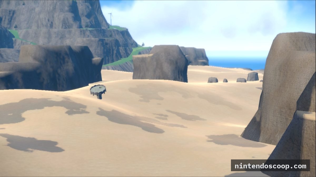
Pokemon Scarlet and Violet top the list for poor graphics. The Pokemon models have detailed textures, but the rest of the visuals are weak.
The Paldea region shows clear cut corners, especially the lack of scenery. Water is flat with no shading, fields are barren, and the desert has little detail. The game also drops frames often, while Xenoblade Chronicles X: Definitive Edition looks far better and holds its target of 30 frames per second.
Game Freak appears to have learned from this. Pokemon Winds and Pokemon Waves were expected in 2026 but are now releasing in 2027, and the trailer suggests a noticeable graphical step up from the ninth generation.
Pokemon Brilliant Diamond and Shining Pearl
We understand that Pokemon games were made on a strict schedule, and developers' work is still appreciated. Even so, Pokemon Brilliant Diamond and Shining Pearl have some of the weakest graphics in the series.
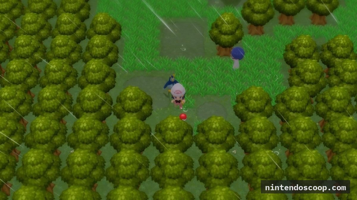
The problem starts with the art direction. The original DS games used chibi-proportioned trainers in the overworld, but those were a technical limitation rather than a style choice. The remakes keep that look even though the models are now 3D, so the trainers appear shrunken in the overworld and normally proportioned in battle. Close-up camera shots also reveal blurry textures on character faces, and water looks like blue gelatin.
Mario Kart Wii
Mario Kart Wii is more of an honorable mention than a serious problem. It reuses many character models from Mario Kart: Double Dash, and its bloom effect makes everything look washed out and grainy next to Double Dash's more vibrant colors. A bloom removal mod by GagePerchance on GameBanana shows the difference, with much deeper colors and far less yellow.
Super Smash Bros. Brawl
Super Smash Bros. Brawl's graphics are fine, but its art direction is questionable. The Wii was Nintendo's most popular console at the time, yet the team chose a realistic style over a bright, colourful one.
That works for Snake and Link, but it clashes with cartoony characters like Kirby, Pikachu, Toon Link, Yoshi, Olimar and Squirtle. Super Smash Bros. for 3DS and Wii U returned to a more vibrant style, and Super Smash Bros. Ultimate added simple detailing on top of that.
Super Smash Bros. Melee's graphics were impressive for 2001, and its art direction is unlike anything Nintendo has used since. Donkey Kong has very long limbs and Yoshi has a very different face and posture, showing how the company translated its characters to 3D at the time.
Sources and links IGN for the picture! GagePerchance on GameBanana,
Comments